
Form follows function.
Design is important, no doubt about that. Design structures, creates character and improves usability. But no design – even the best – replaces functional specifications. And neither should it conflict with them. It goes without saying that you would like to see “something tangible” quickly. But hold on, this is not a good idea.
A common example in development projects: the functional specifications define the following: “Implementation of the separately contracted design work in templates. The design will be delivered latest by the end of phase 1.” In a later part of the specifications that deals with the concrete functional requirement for “contact person” we read: “Contacts (individually editable data sets) are listed on one page, sorted in alphabetical order. The following information is collected: Academic title, first name, last name, department, e-mail, phone number.” The contractor calculated the time that it would typically take to implement the above mentioned. The contract is signed. The deadline for phase 1 approaches, and passes. - It comes as no surprise that there is more need for discussion about the design than expected and that the designer needs to make several extra revisions (hopefully paid ones). The CMS experts/developers have to meet their own deadline and are already starting to configure the data sets.
We finish building the contact page - which is now ready to be styled – when, with several weeks delay, the screen design is submitted. The excuse: ”Unfortunately, it took longer because we weren’t entirely happy with the A-to-Z bar and the arrangement of the portrait images.” – Wait a second … A-to-Z bar? Are we talking about jump marks or filter functionality? And the technical specifications didn’t say anything about images either. Furthermore the layout file shows a (non-functional?) search field. What happened? Either the design agency didn’t receive or didn’t read the functional specifications. But true, the page looks better with images. We are reaching out to the client and explain that new elements and functionalities will cause additional charges. The reply: “There is no budget for additional costs.”
Oh well, no problem. We are just going to refocus on the design elements that correspond to the technical specifications in our contract and ignore the rest. The client disagrees: “The page has to be implemented as shown in the design file, the management already approved it.” The result: we are trying to avoid feature creep as well as maintaining a positive atmosphere. Both of which can be very time consuming.
By the way, our example is flawed: An experienced CMS agency knows this kind of pain and would have calculated a budget that includes these risks or made it clear that the implementation of the (unknown) design is not part of the contract but would need to be contracted additionally once the design actually exists.
Principles, not pixel
All of this shouldn’t be a problem if we assume that the design and CMS implementation are done by the same contractor, shouldn’t it? – Agreed. It makes things easier. But even then should the functional specifications remain binding. It is not the role of a designer to discuss functionalities with the client. The designer creates designs for certain elements but the question whether these elements are needed or which interaction they cause is part of the technical concept. Designers may come up with suggestions on how to visualize e. g. the look of the A-to-Z bar if such a bar is requested. They show how elements in a teaser are positioned to each other. But they cannot make the decision about whether teaser images are used or not. By the way, the design should offer options for teasers without images and show how the design behaves with texts of different lengths.
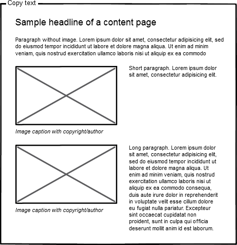
Have you ever heard of wireframing? It’s a really useful tool. Wireframes are simple drafts that visualize information architecture and functional elements. They help to clarify how requirements should be implemented and designed. Once this step is clarified, development and design can both do their work. Regardless whether entire pages or individual components were discussed. All that matters is that the discussed concept clarified all relevant questions and will not be changed later.
Let’s not forget: We are building an editorial (workflow) system. Content is going to change regularly (otherwise why would you need a CMS?) We don’t know yet what future content will look like which is why we cannot design its details yet. But of course, it should look good. At the same time, we don’t want to force content into a too rigid design.
Which is why we need design principles. An image should not be a requirement but an option. Headlines over three lines should be possible because they happen. You should have the designer document these design principles for further reference or in the event you want to adapt the design to new requirements in the future. In this case the design team’s work will result in a style guide (design manual) or “pattern library” – a compilation of recurring design elements – and not simply be a bunch of Photoshop layouts.
Asking the right questions is also important during the project. A few examples:
Typography
Nowadays we are lucky to have a large variety of web fonts available. If the design uses a font family that is less known, make sure to find out whether you need to purchase the licensing and whether your budget can cover it. Also be sure that the fonts are displaying correctly for different operating systems, browsers and on various devices.
Let the designer show you examples of text and headlines in all required hierarchies, ideally as part of an HTML-page. Also inquire about changes in font size for display on e. g. smart phones and have them explain the rules that cause the changes.
Colors
Which colors will be used for fonts, for backgrounds and lines, and which for hyperlinks and buttons? Is there a color for error states in web forms? If you included accessibility requirements in your specification (which we recommend) have the designer explain to you in which ways the design follows them, e. g. contrast ratio of font and background color.
Images in text
You want to clarify all elements: A caption consists typically of more than one line of text. There might be a copyright notice or a reference to a Creative Commons License. If the container with the image and caption is positioned next to running text the spacing needs to be defined as part of the design. Is the text floating around the image? How is the layout going to behave if the text is short and the following paragraph also contains an image?
Navigation elements
The design shows links. But how do they change their appearance when hovered over by a mouse or activated via keyboard/touch screen? How do they look after being clicked and what about links to already visited pages? The main navigation works for up to which depth? How would the (sub) menu look like if the path is Press > Downloads > Product > Makeup > Organic-Makeup? Is there a difference between buttons of higher importance for the user experience (e. g. “Register”) and buttons of lesser importance (e. g. “Delete”)?
A good concept can handle many designs
One of the advantages of a CMS: The content is usually separated from the layout. This allows you to develop a design further or improve the old one (e. g. make the design responsive) without affecting the content. Which is why you don’t need to start with the design when planning a site. The information architecture should be planned sustainably and carefully because it will last - even when taste or trends change.